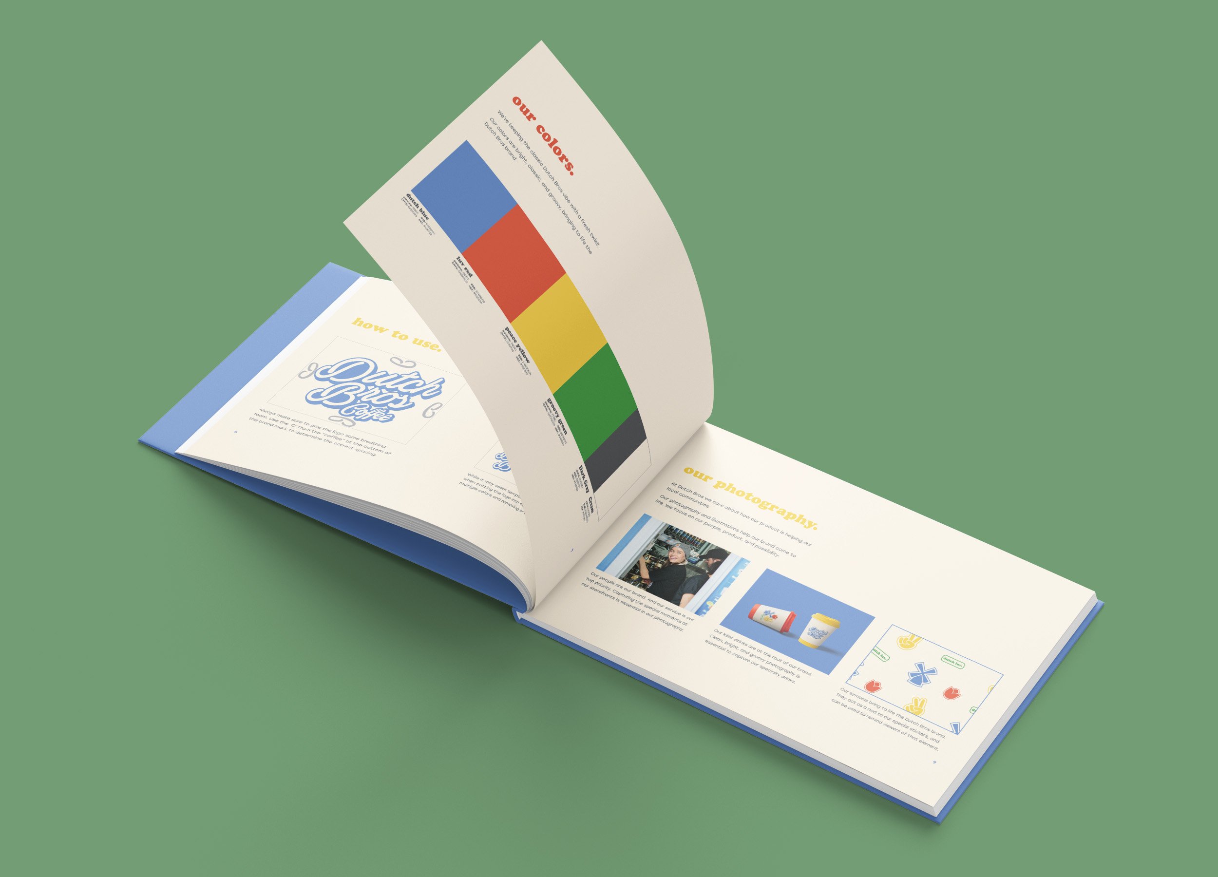
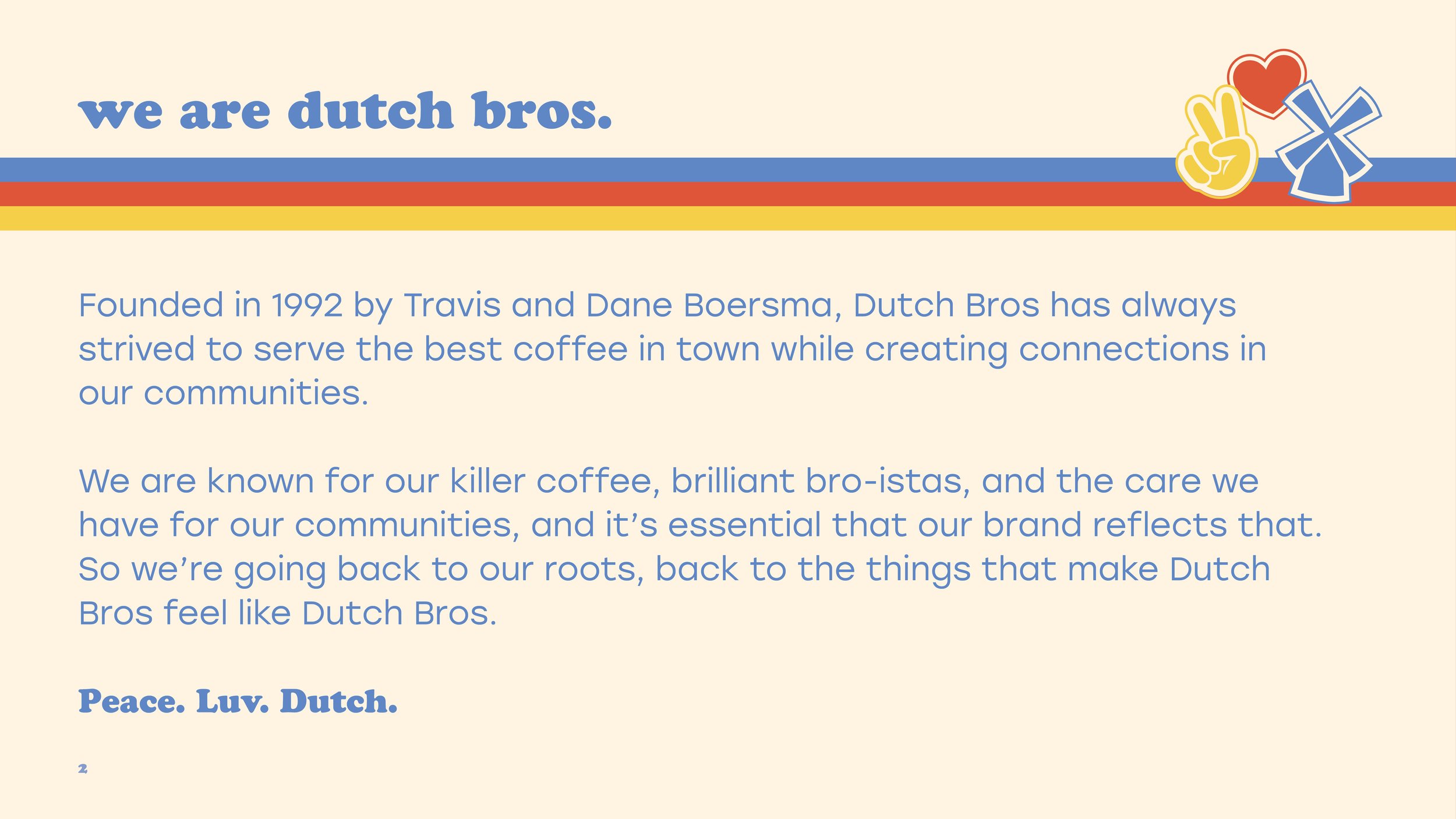
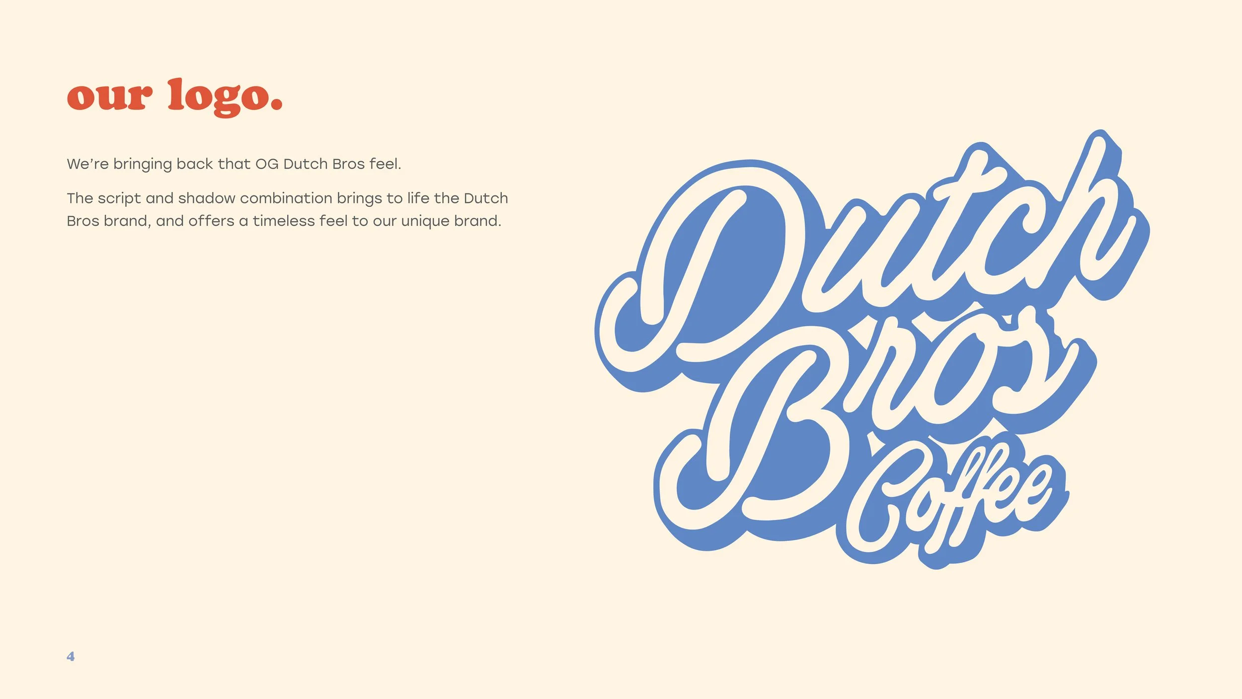
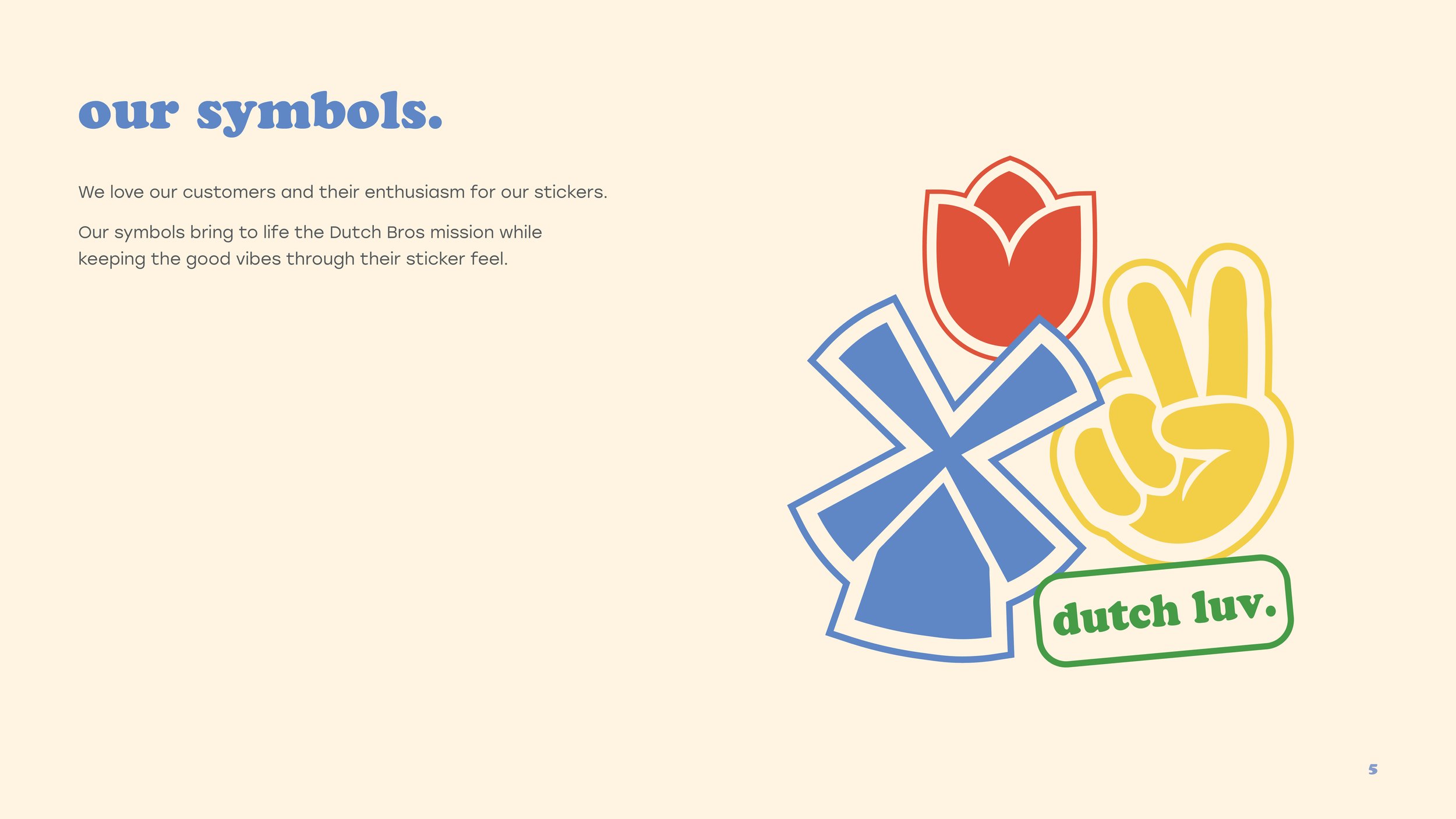
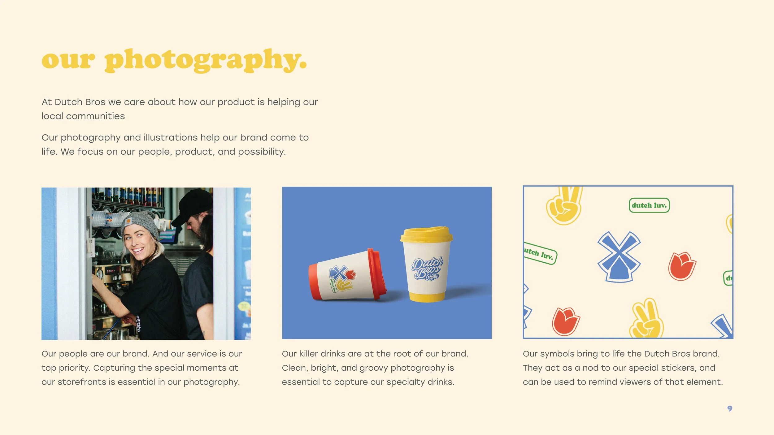
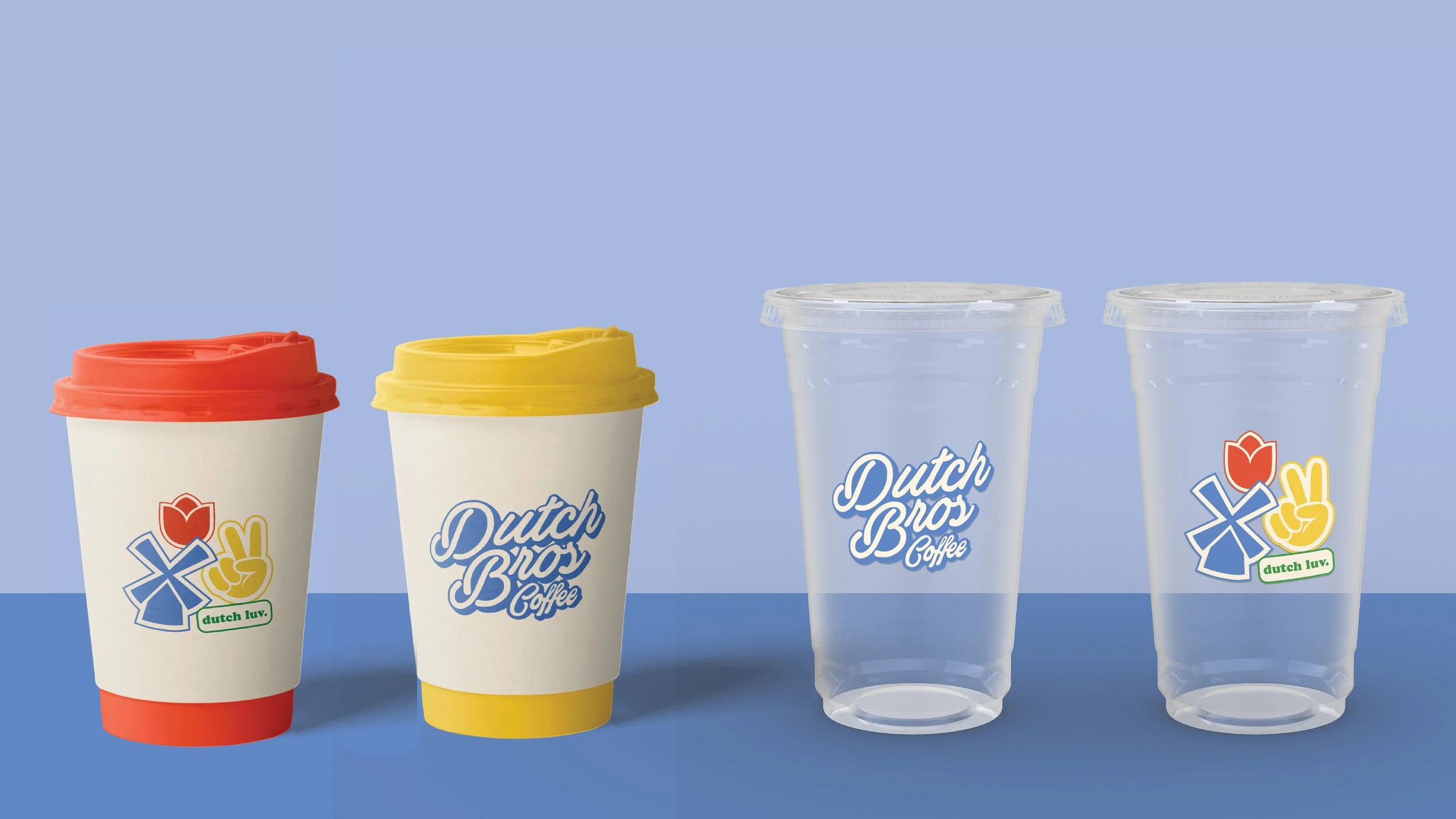
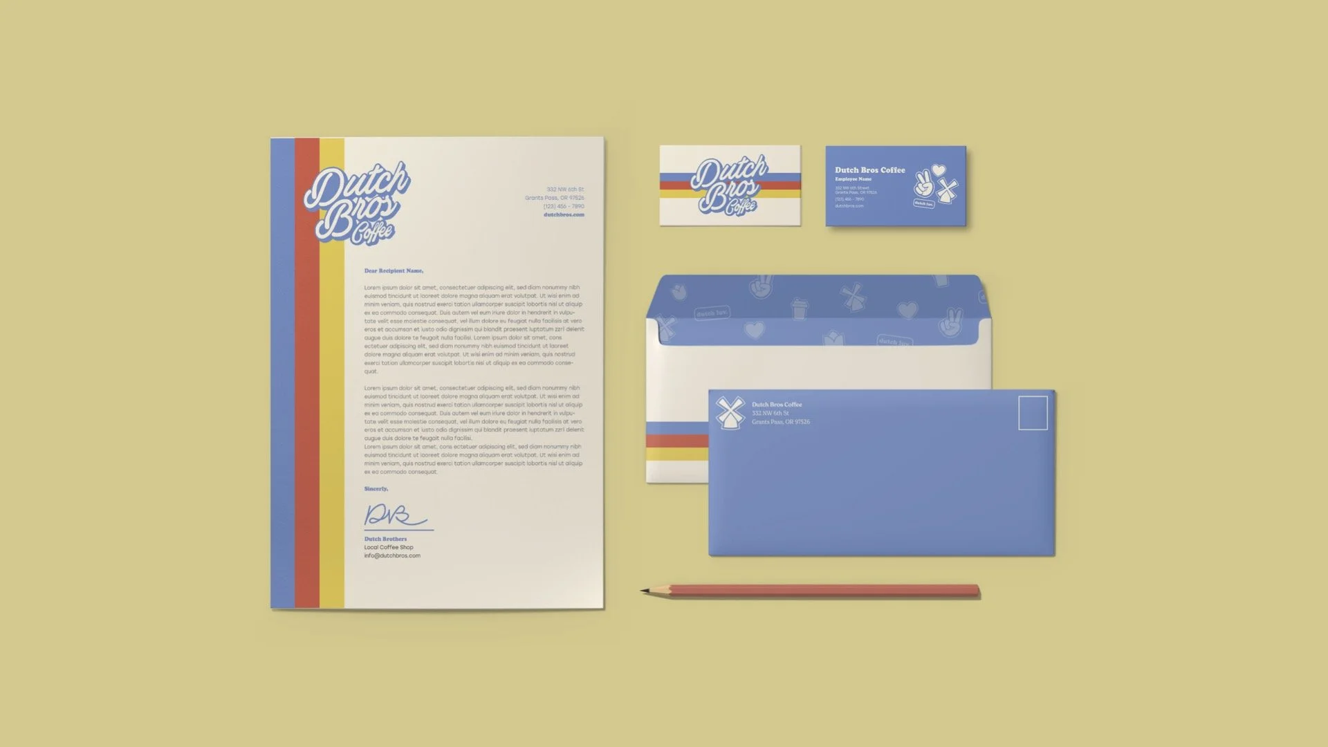
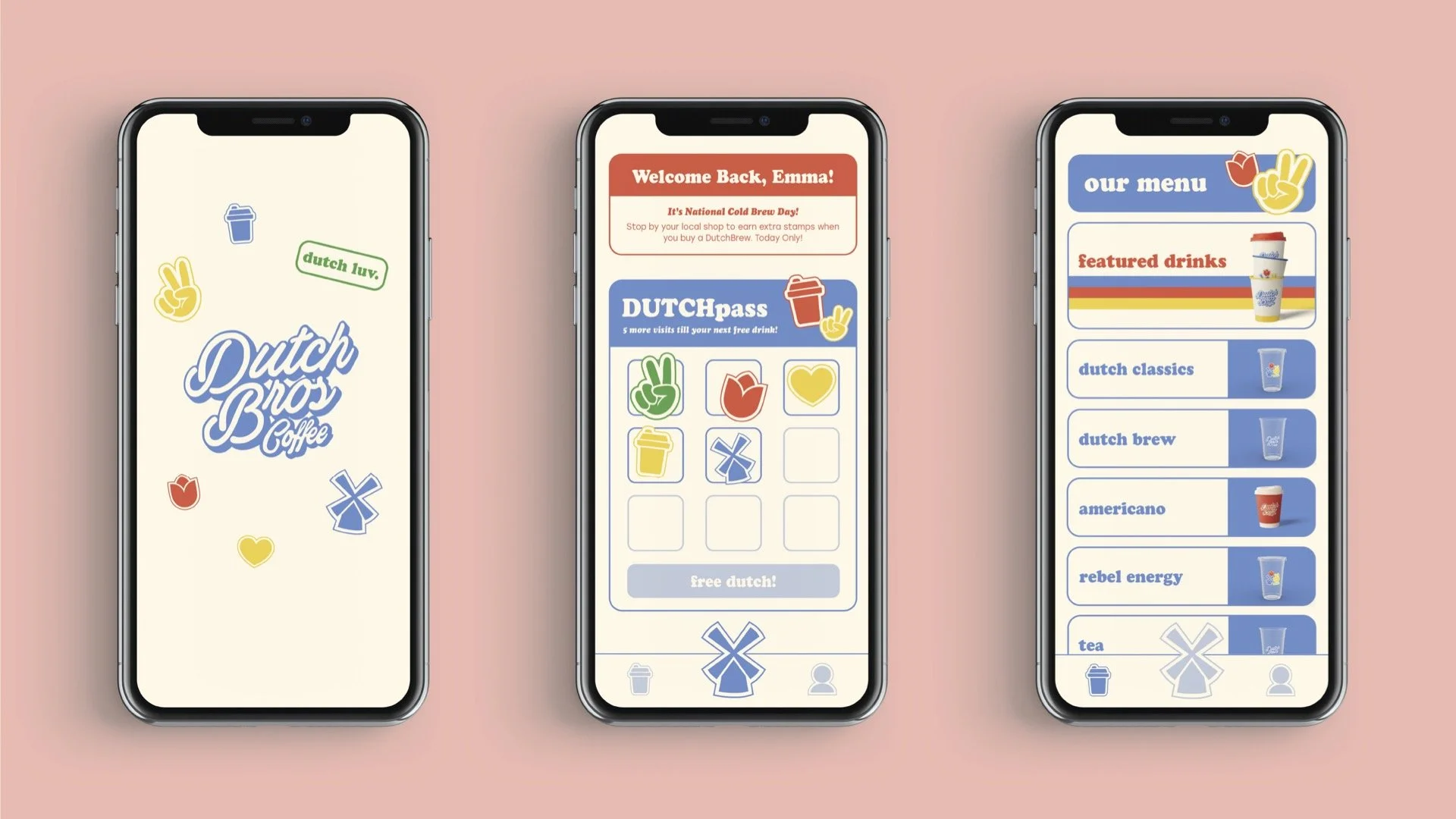
Dutch Bros is a beloved coffee chain on the west coast that is known for its friendly “broistas” and ‘killer’ coffee. This brand refresh aims to bring Dutch Bros back to its roots: personable, friendly, but still cool. It brings back the retro feel the brand encapsulated when founded through the bright primary color palette and funky illustration style. The rebrand also brings a newly designed app to bring Dutch Bros into the digital age, transforming their staple ‘punch card’ rewards into an in-app function for users to enjoy. Lastly, a refresh of the hot and cold cups brings the brand back to its retro roots. As always, Peace, Love, Dutch.
Branding, UX/UI, Print
Rebranding
In 2018, Dutch Bros Coffee went through a major rebranding and introduced a new logo that seemed to lean into the corporate coffee shop style. The new logo completely lost the funky, retro, and friendly feel and traded it for a ‘Starbucks’ style instead. Many feel that this is not the right style for Dutch Bros - even though they are a large corporate brand, they have the feel of a local coffee shop. Keep scrolling below to see how I brought back the ‘funkiness’ and ‘friendliness’ of the old Dutch Bros into a new branding system!
What did it look like before?
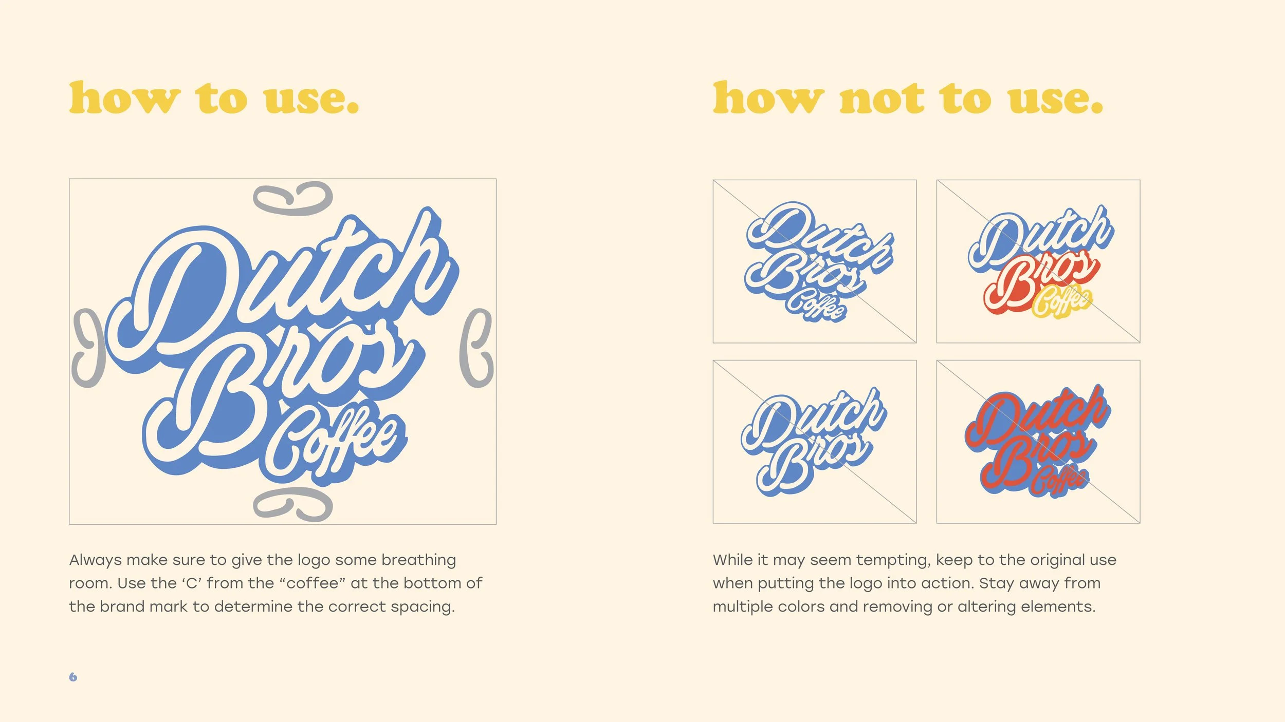
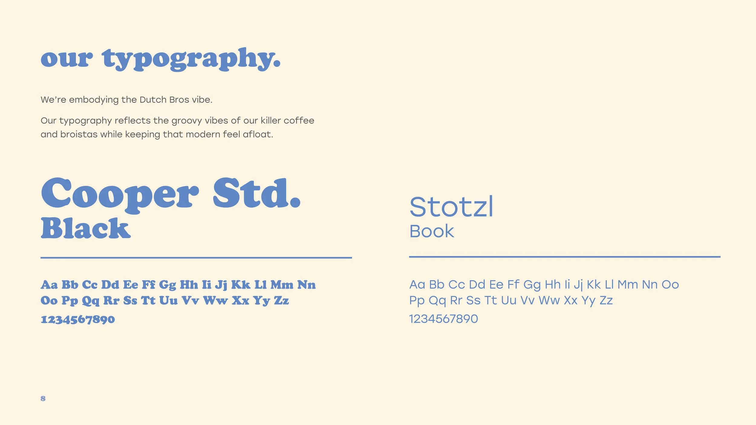
take a look inside the brand book…


